Wednesday 31 December 2014

Living with Light

It is around this time every year (post-Christmas, still the school holidays) that I cast my eye around my lego-strewn and Peppa Pig-assaulted house, and despair.  I know that underneath it all there's a nice sofa and a lovely rug etc., but nonetheless I begin to wish that my natural decorating taste ran to something a little emptier, more considered, something resembling this:


Which is by Axel Vervoordt, the legendary Belgian art and antiques dealer and interior designer who has worked with, among unnamed others, Pierre Berge, Dries Van Noten, Calvin Klein and Kanye West (his Paris house.  I don't know who is responsible for the $20 million Calabas 'dream house' that he and Kim are rumoured to be about to move into, and am on tenterhooks waiting for AD to cover it.  They will, won't they, surely . . . .? )  Vervoordt has also just done the penthouse at the part-owned-by Robert de Niro Greenwich Hotel, New York, which I now want to decamp to on a permanent basis.

The Penthouse at the Greenwich Hotel, New York

The Penthouse at the Greenwich Hotel, New York

There's a book on my shelf by Vervoordt entitled Living With Light, from where I appropriated the title of this post, but even if there hadn't been it is one of the features of his work that makes it so exceptional.  His rooms, to me, speak of the golden age of Dutch painting - there's a Vermeer-ness to them, to the way that light that pours into them.  I'd like to say it's due to geography, but that doesn't explain the beauty of Vervoordt's projects in countries beyond northern Europe.

The Milkmaid, by Johannes Vermeer

So here are some more rooms by the great Axel Vervoordt, and sons, who both work for him in his atelier.  It really is gloriously renaissance-like, especially when one discovers that he also makes products for the home - his sofas and chairs are some of the most beautiful I've ever seen - and there's an actual art gallery too.  (Vervoordt bought his first Lucio Fontana in his twenties, and there's a passage on the artist in Living with Light, his slashed canvases "with a seemingly infinite space at the centre are like portals into the void.  Pregnant with possibility, the cuts are openings into new dimensions that absorb light and seek to explore the universe and it's infinite reach.")

Concetto Spaziale by Lucio Fontana


So this year - along with giving blood more regularly and being more patient with my children and eating less sugar and being a better wife -  and I'm going to attempt the art of more considered collecting.  How that's going to marry with the aforementioned lego and Peppa Pig I'm not entirely sure, but don't these images make it look worth it?

www.axel-vervoordt.com

Sunday 5 October 2014

House & Garden: The Fifties House

"If the Sixties was the time Britain threw off the shackles of grim, post-war austerity then the Fifties was the decade we began picking the lock," writes Terence Conran in the foreword to the latest tome that makes use of Conde Nast's remarkable archives:  The Fifties House.  Identifying the decade as a turning point in the design world, his tells us how at the start of it "all you could buy in furniture was shiny reproduction Georgian pieces or huge cocktail cabinets that looked like glossy, veneered, bucolic charladies", and explains that the changes wrought were due to the influence of "a remarkable collection of architects and designers on the West Coast of the US, including George Nelson, Eero Saarinen, Alexander Girard, and particularly Charles and Ray Eames."

The changes were, naturally, documented by House & Garden Magazine - and here, in a book curated and written by Catriona Gray (House & Garden's Books Editor) they are presented in a manner that manages to be both enlightening and exciting - for anyone with an interest in the history of design, there's as much to learn as there is to admire.

The book is split into unequal thirds, the first being given over to the treatment of individual rooms, starting with the kitchen.  It was the Fifties that saw the widespread installation of the fitted kitchen (and the kitchen island), that introduced the concept of the kitchen as being a place to entertain guests as well as prepare food (which meant that people started caring what their appliances looked like) and "Because the homeowners were spending far more time in the kitchen than in previous generations, it made sense that, for the first time, this room became a hub for design trends."

Terence Conran's open-plan dining area and kitchen.  A Nigerian blanket is used as rug on the birch-plywood floor, the dining chairs are by Gio Ponti and the large spherical hanging lamp is by Noguchi.  The wall behind the white kitchen units is faced with ceramic tiles in House & Garden's 'Deep Night', from the magazine's colour range.  (This is actually from the middle third of the book, rather than the first third, but it is still a kitchen.)

Next up is the sitting room, which in the Fifties became "a multipurpose living space that was used to relax, entertain, play, eat and work."  We learn about the changes in heating (including an unsuccessful alternative to underfloor heating:  ceiling heating - "It was supposed to mimic the warming effects of sunlight, but in practice people's heads became overheated") and the introduction of the television changing the layout of the room.  Plus, fitted carpets became a popular choice, "often in an eye-catching pattern or bright colour", walls were painted or covered in patterned wallpaper (and feature walls were most definitely 'in'),  patterns often stemmed from science which Gray links to DNA being discovered in 1953, animal prints became widespread due to the French interior designer Madeleine Castaing . . . 

This exotic sitting room was designed by House & Garden photographer Anthony Denney, who was decoration editor of Vogue when this was shot in 1959.  White walls allow his collection of curiosities to be shown off to the full.  This sitting room is ahead of its time: as air travel became more popular in the Sixties, interiors increasingly displayed their owners' collections of curios from other cultures and exotic locations.

Further chapters are given over to the dining room, the bedsit & studio room (House & Garden actually ran a feature on interior design in university rooms - 'How to Read for an Honours Degree in Comfortable Self-Containment' - how amazing?!), the bedroom, and finally the bathroom, which is possibly my favourite chapter in this section.  "The days of the nondescript bathroom are over," wrote House & Garden in 1953, and my goodness they meant it.  There are several which I'd be quite thrilled to have in my house today.  Just look at this one:

While the dressing alcove is prettily pink, the bathroom itself takes classical Rome as its influence.  a mural on the wall makes the decorative reference crystal clear and is supplemented by the sunken, tiled bath, day bed and elegantly draped fabric - classical decadence reinterpreted for the United States of the 1950s.

It's perhaps not surprising that I find myself falling in love with these bathrooms for "In general, bathrooms haven't changed much since the Fifties.  Then, as now, the typical bathroom consisted of a matching three-piece suite of lavatory, basin and bath.  The difference is that there was far more deliberation about the design of these during the Fifties than there is today."  The other major change was that, with the bathroom moving inside the house, bathing had become an enjoyable experience and "Magazine articles suggested ways of injecting character into what was traditionally a cold and faceless room."  There are moments, it's true, when some of the bathrooms look a little dated - but they look rather comfortingly so, to me, reminding me of the bathrooms at my grandparents' houses:

A large floral-patterend wallpaper covers both walls and ceiling of this 1959 bathroom.  There is even a matching shower curtain.  A simple colour palette creates a smart effect, with matching blue storage containers, stool and table lamp, and wood painted in black gloss paint.  Opulence is created by the deep-pile white carpet.

The middle third of the book is simply entitled 'Houses' and contains several complete stories - among others the basement flat of designer Roger Nicholson and his wife Jane, the advertising artist Ashley Havinden's Queen Anne house in Hertfordshire which he filled with modern furniture, Le Corbusier's flat in Paris, the four-storey Cheyne Walk house belonging to the Fifties designers Robin and Lucienne Day, Hans and Florence Knoll's (of Knoll Associates) Paris apartment, photographs by Charles Eames of Alexander Girard's house at Santa Fe, and Terence and Shirley Conran's first home from which the first photograph in this post is taken.  (As an aside, their latest home is featured in the November issue of Living Etc.)  The book is an essential buy for this section alone, showing as it does the very best of the period, the houses and apartments of its most important and influential designers.  

Le Corbusier's studio on the eighth floor runs the whole width of the flat.  The exterior wall is made of glass, with an opaque panel in the centre to break up the light.  The painting is by Le Corbusier.

In the open-plan living area of this Paris apartment (belonging to Hans and Florence Knoll) much of the furniture is of a forward-looking, modern design.  The small armchair by the table was designed by Eero Saarinen.  Plants and flowers are used to soften the severely simple lines of the furniture.

The final third of the book is 'Decoration', and catalogues the new furniture (there's a delightful image of a Danish teak-veneered bookcase and desk from Heal's, accompanied by the words 'How useful for David to have a desk and me to have a storage cabinet and a bookcase and a bureau - and really outstanding, upstanding flower stand.  I do hope David won't mind.') patterns, colours and textiles.  There are patterns for Heal's and Liberty, wallpapers for Sanderson and Cole & Son, and of course House & Garden's range of colours, for, throughout the Fifties, the magazine created it's own paint which it updated annually and marketed through a number of stockists.  

Indeed, House & Garden was as much a style-setter as it was a chronicler of the age, for it was in large part due to the magazine that the trend for using brightly coloured paint on walls and furniture took off.  "As the Fifties drew to a close, the foundations had been laid for a new wave of brighter, modern interiors.  More was to come.  Roll on the Sixites."  

Roll on the next book, too; I'm longing for the next instalment. 


Fifties House by Catriona Gray is published by Conran Octopus, you can order a copy here.

Wednesday 24 September 2014

Dries Van Noten's Amazing Carpet Catwalk

Dries van Noten

This is the finale of the Dries van Noten Spring Summer 2015 catwalk show that took place in Paris earlier today (today being Wednesday.)  And while yes, the clothes are lovely, can we please talk about that carpet?!  Which is by Argentine rug artist Alexandra Kehayoglou, and is so beautiful that I want to cover my whole house in it.  I'm not sure 'pastoral idyll' sufficiently covers it.  Entirely hand-tufted in wool, Kehayoglou (her grandparents were Greek) is inspired by the Argentinian landscape.  Here are some more of her designs:


Dries Van Noten cited A Midsummer Night's Dream as his inspiration for the collection, "It was about a girl who loves festivals: Stonehenge, Glastonbury, Burning Man.  She loves nature; she doesn't follow the rules so she puts on precious fabrics in whatever way she wants."  And the clothes are beautiful - one of the stripy bomber jackets is absolutely on my wish list for next summer.  It's just not quite as high up as a carpet by Alexandra Kehayoglou . . . 

Incidentally, when it comes to Dries Van Noten and interiors, his house just outside Antwerp is quite literally one of the most beautiful houses in the world.  It was photographed, by Francois Halard, for the March issue of Vogue US:


And his garden . . . HIS GARDEN:


Note the title of the story:  Garden of Eden.  Just like his catwalk . . . (Oh, and for anybody in Paris, there's still time to catch his exhibition at the Musee des Arts Decoratifs, which has been extended unit the 2nd November . . . )


www.driesvannoten.be
www.alexkeha.com

Monday 22 September 2014

Fantasy Interiors (aka my Decorex wish list)

I meant to go to Decorex on Sunday, but then Sholto got invited to a party, and these days, I'm all about tailgating my children's invitations.  I used to compare their parties to the 7th circle of hell.  I now think that they're the best kind of entertainment there is:  who doesn't want to spend two hours eating crustless sandwiches, mini sausages and generous slices of a giant Teenage Mutant Ninja Turtle chocolate cake, before having a foam assisted dance-off to the hits from Frozen, all the while knowing you'll be home in time for a bath and bed at seven?  Children's parties are ace.

So anyway, I went to Decorex today.  And I'm really glad, because apparently yesterday was packed.  Today there was barely anyone there bar me, my friend Libby (who was actually working on one of the stands) and Mark Francis from Made in Chelsea.  Partly, I think it's emptier because it's moved  from Kensington Gardens, i.e. easy peasy, to Syon Park, which is less so.  (Though there are some really nice houses in Twickenham.  My sat nav ran out of battery half way there, so I got a good look at some of the lesser-travelled streets.)

And, as ever, I've come away with plenty of ideas for the next house.  And I'd quite like to move.  Aside from anything else, it would be really nice to be able to buy treats from the local deli on a regular basis.  When your local deli is Ottolenghi, those treats would practically pay for a new house . . .

The first two stands, as you walk in, are De Gournay and Zoffany, which makes entering the fair a positively celestial experience.  And as ever, when it came to Zoffany, it was the chinoiserie that I fell for.  These are parts of the same panel.  I'm besotted.  I'd forgo Ottolgenghi forever for walls covered in this - even their flourless chocolate cake, which anybody who knows me will understand is a sacrifice of serious magnitude.

Zoffany

Zoffany

There were more (and potentially rather more affordable) examples of Chinoiserie elsewhere, both of which I also love:

This one is by Thibaut and would, I feel, look especially brilliant in quite a narrow corridor.

This is brand new paper by Nina Campbell, from a collection entitled Cathay Parade, and it is so delicate and pretty that I think it would look good almost anywhere.

And then there is one other wallpaper I'd like to draw your attention to before I move on to other items, which is this:

Eley Kishimoto

It's by Eley Kishimoto and it's the first wallpaper the (fashion) house have ever done and their entire stand is covered in it:  walls, floors and ceiling.  And the girl on the stand is wearing a dress in the same pattern (best party trick ever) and they were awarded 'best stand' yesterday.  (If you're going to go for the literally all over look, incidentally, it might be worth doing it with a smallish room.)

Anyway, on to fabrics . . . Though actually - and it's not just because I'm wallpaper obsessed - I genuinely believe that this fabric makes a particularly lovely wall covering:

It's by Swaffer and I love it so much I actually enquired as to price . . . and it's under £60 a metre!  Which, in the realms of my fantasy world, is so reasonable that it's almost worth ordering it now to do something with.  One day, in one house, this will be blinds and wall coverings and everything.  I'm going to have a rainbow room.

You'll notice I didn't mention the floor.  That's because I have a plan for the floor in my rainbow room, and that plan is this:

The floor at the Nina Campbell stand!  

Combined with this:

A fluffy rainbow rug!  It's Boccara Design, and I don't think I've wanted anything quite so much ever, at least not since the Zoffany chinoiserie a tiny bit further up the page.  This truly is heaven, that pile is so super thick that one wouldn't actually need to invest in any furniture as one would want to spend all day lying on the floor. 

And the other textile that rug would go really well with, if one weren't going to pair it with the rainbow zig-zags, is this marbled velvet by Glasgow design duo Timorous Beasties which I think looks like butterfly wings.  We're talking major fantasy curtains:

Timorous Beasties

And talking of beasties, get ready for a very tenuous link . . . :

This is by Dandylion - it's an archive fabric which they've updated with different colours, and I genuinely think it might be the most perfect nursery fabric ever - except, obviously, for Chelsea Textiles Moon Dog by Kit Kemp which really is the most perfect nursery fabric ever (have you been to Ham Yard Hotel yet?  The chairs in front of the fire are upholstered in it.  And Andrew and I had a very nice lunch there, too.)  But back to this - the lion! And the unicorn!! 

And it would look utterly amazing when combined with this:

Rug by Amy Kent - she says that the design is based on cobbles but as far as I am concerned it is a giraffe print - L'Afrique, C'est Chic!

And finally, here are some lovely lights:

Celestial Pebbles (yes that really is their name) by Ochre.

I was overjoyed to find those lights, because I went to 100% Design last week and came away horribly depressed because I barely found anything I liked and nearly all the lighting looked the same.  And all the bathrooms and kitchens were black.  Speaking of which, I also found some amazingly beautiful marble at Decorex, but such is it's amazingness that it requires a whole blogpost of its own. Here is a tiny preview though:

Honey Onyx by EDM . . .


www.zoffany.com
www.thibautdesign.com
www.ninacampbell.com
www.eleykishimoto.com
www.swaffer.co.uk
www.boccara.com
www.timorousbeasties.com
www.dandylion-designs.com
www.amykent.co.uk
www.ochre.net
And that marble from EDM (which more usually stands for Electronic Dance Music) is so special it doesn't have a website . . .


Thursday 18 September 2014

Art & Craft at Kirsty's Handmade Fair

My relationship with 'craft' is, truthfully, not that great.  Basically, I'm better at buying it than I am at doing it.  It's one of those things - like cooking - that I totally mean to get the hang of, i.e. I fully intend that one day I'll make staggeringly beautiful quilts (in a How To Make An American Quilt kind of way) - and there's a bit of me that aspires to the handmade embroideries in the V&A -   and then it takes me an hour and a half to sew on three name tapes and I remember the issues that I'm facing:  impatience, lack of lasting enthusiasm, and, most crucially, total ineptitude.  (And my mother-in-law already makes staggeringly beautiful quilts, so I don't really need to.  As for the embroideries?  There's a tapestry I was given when I was 10 that I still haven't finished . . . )

But every so often I forget all those things, and cheerfully go off to spend an afternoon at the V&A learning how to make paper cut-out bunting with Kirsty Allsopp and Poppy Chancellor, because, you know, it sounded fun, there was the promise of cupcakes, and we all love Kirsty, don't we?

It transpires that making paper cut-out bunting is ridiculously time consuming, horribly fiddly, and actually not that much fun.  What was enjoyable was eating the goodies from the Hummingbird Bakery, and chatting to the other women there - about our children, yes, but also about Russian art, Russian emigres, the future of 'handmade' (I was sitting opposite the editor of Selvedge Magazine) and who are the contenders for best playwrite of our time (we never definitively agreed on an answer.)  And that bit, the cake and - more pertinently - the conversation, made spending two hours with a scalpel worthwhile.

And at least Kirsty was doing it too.

And this was tea . . . 

And that is Kirsty's point - that craft is about bringing people together, forming and preserving communities - it's a bit WI-y, but kind of brilliant and why she has launched The Handmade Fair, which opens today at Hampton Court and is on all weekend.  There are numerous skills workshops, from painting furniture with Annie Sloan (I've already done that course - at the Phoenix on the Golbourne Road - and it's brilliant, though I've yet to actually put any of it into practice at home - I initially visualised Omega workshop/ Charleston-like wardrobes, doors, floors and everything else - see 'lack of lasting enthusiasm') to food decorating, sewing (though not name tapes, I note), Etsy business school . . .  basically everything that any craft enthusiast could possibly dream of, and more.

The drawing room at Charleston

Fortunately, for people like me, there's also shopping . . . .

I love Molly Mahon's block printed fabrics, wallpapers (which you can see at Tent, also taking place right now) lampshades and stationery.  I have rather a lot of it already, but there's always room for more . . . 

I'm obsessed with everything about The Painted House.  I fully intend to actually buy some of their rollers, and redecorate our walls - or at least the cupboard doors - at home.  I feel that this is within my grasp.  Maybe . . . 

How hard is it to find attractive place mats?  Answer: very hard.  I know this because I've actually spent a long time looking.  I could make my own!  (If I were even remotely talented.)  Or I could buy these.  How pretty?

There is one very valuable lesson that I took away from the craft workshop, however, and that is that next time one of my sisters gets married, I'm totally inviting all my friends over for bunting-making and cake.  Many hands, it transpires, really do make light work . . .  (and nobody at the V&A tea resorted to stapling the triangles onto the ribbon.)

www.thehandmadefair.com


Sunday 14 September 2014

Fine Photography: Where to Find It, How to Buy It

Between the various photography exhibitions that are currently running (Dennis Hopper at the RA, Horst P. Horst at the V&A, Edwin Smith at RIBA, to name but three) and spending a good couple of days thoroughly immersed in a review copy of Vogue The Gown (coming out next month, it's amazing, pre-order it now) I've spent more time than usual dwelling on that particular medium.

Edwin Smith:  Campo San Giorgio Maggiore, Venezia, Italy, 1961

Photography is one of the fast growing segments within the art market.  Collecting it in itself is not new - it was practically simultaneous with the invention of photography:  P&D Colnaghi were selling photographs as early as the 1850s, representing the work of Roger Fenton and Julia Margaret Cameron - about whom I once wrote a paper while at university.  (Pointless aside.)  But early photographs were usually collected to be kept in albums, not hung on a wall, which is certainly not the case now.  (There's a lengthy explanation, incidentally, which I'm mainly glossing over - but photography first started properly being viewed as a fine art form in the 70s, which was partly to do with artists like Cindy Sherman and Richard Prince etc., and partly to do with museums forming photography departments and appointing dedicated curators.) And whether it's early photography that one is interested in, or fashion photography or landscape photography or the work of young photographers, the market is responding to demand:  i.e. there is a lot of choice.  (The Paris Photo fair has become so successful that, as of last year, it takes place in LA, too.)

So I asked my brilliant friend Brandei Estes, who is Deputy Director Specialist Photographs at Sotheby's, (and who has previously worked at the Michael Hoppen Gallery, and at Brancolini Grimaldi, and at various other places besides - she knows everything) for her tips on collecting:

1.) Be informed.  Know the galleries that represent photographers; go to the shows, speak to the gallerists; go to the fairs, meet the dealers; go to the auction houses and look at the pre-sale exhibitions.

2.) Understand the difference between the primary market (a gallery exhibiting and selling new work by an artist) and  the secondary (anything sold by a dealer or at auction.)  Be aware that the estimate at auction is always going to be lower than the price of a piece sold on the primary market.  

3.) Understand the process.  A vintage print by, say, Cecil Beaton will be more expensive than a modern print which will be one of an edition offered to the market by Beaton's estate.  And, when it comes to editions, limited editions are better than open editions - and the smaller the print run the better.  Techniques have developed and changed over the course of time - pre-80s photography was mainly printed by hand, for instance - this can affect the price and the longterm value.

4.) Provenance is key, whether you're buying from an auction house or a friend.

5.) The condition is important.  Saying that, vintage prints will usually be a bit scratched and beaten up - I'd be very suspicious of a vintage print in perfect condition.

6.)  But ultimately, buy what you love, be aware of your budget, and be careful with your expectations (nobody can guarantee that what you've bought is going to quadruple in value within five years.)

My own, rather limited, collection of photography is very much founded on that sixth principle, insofar as I've only ever acquired what I love - although I've been fortunate, and have been given some of the pieces that I treasure, such as this:

Marie Helvin by Barry Lategan for Vogue 1971.  

As always though, there is so much more that I would love to see hanging on my walls, and I often find myself pouring over the catalogues of the Sotheby's photography sales - there's a particularly tempting Man Ray sale taking place in Paris on 15th November:

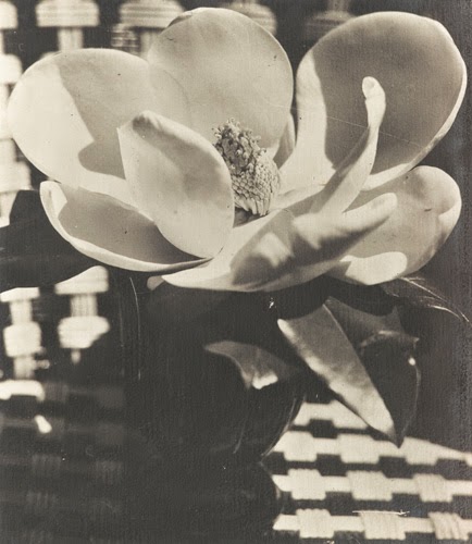
Man Ray, Magnolia Flower, 1926, silver print, estimate: 30,000 - 50,000 EUR

Man Ray, Lee Miller with sponge necklace, 1930-31, silver print, estimate: 40,000 - 60,000 EUR

Tragically, I'm not sure that my bank balance will be able to support my bidding on either of those (unless of course I win the lottery between now and mid-November.  My odds of which would be greatly improved by buying a ticket.)  Nor can I afford a Lucien Herve, the architectural photographer  - he was Le Corbusier's official photographer - of whose work there is currently an exhibition at the Michael Hoppen Gallery and some of whose works will also be found at  the Barbican's Constructing Worlds, Photography and Architecture in the Modern Age, which opens on the 25th September.  I am obsessed.  

Lucien Herve

However, for those who are similarly bank balanced to me, I bring you glad tidings of great joy . . . . . . Lumitrix:

Matilda Temperley (yes, her sister), Dancer 1 (I have this on my stairs.  I love it.)

Dave Watts, Persepolis  (Horst's photographs of the same Iranian temple, which were published in US Vogue in 1949, can currently be seen at the V&A) 

Astrid Harrisson, Circling at Dawn. I fantasise about owning this.  It shows the legendary Marwari horse being exercised in the Rajhastani desert by Marwar horsemen. 

Lumitrix sells in two ways.  They started with the 'Lumiprint', into which category the Matilda Temperley falls:  each is a commercially printed lithographic print on 250gsm silk paper, the edition is 500 (high, but it is still an edition - see Brandei's point number three.)  The Watts and the Harrisson fall into the Fine Art category - professionally printed on fine archival paper each work is in editions ranging from 25-100, depending on the size.  The costs vary, obviously.  A Lumiprint is £50, Fine Art ranges from £90 (for the smallest size at the print run of 100) to £850.  

But what price beauty? FMJ.


Dennis Hopper is that Royal Academy until the 19th October

Horst is at the V&A until the 4th January

Edwin Smith at the Royal Institute of British Architects until 6th  December

www.parisphoto.com

For all upcoming photography sales at Sotheby's, see here (seriously, don't forget the Man Ray on November 15th in Paris though . . . )

Lucien Herve is at the Michael Hoppen Gallery, 3 Jubilee Place, until the 24th October

Constructing Worlds, Photography and Architecture in the Modern Age is at the Barbican Centre from 25th September to 11th January

www.lumitrix.com - oh, and incidentally, Lumitrix are currently running a competition which closes on Tuesday night - you can win a print (amazing, no?!) - all you have to do is photograph the loneliest wall in your house - the details are here.